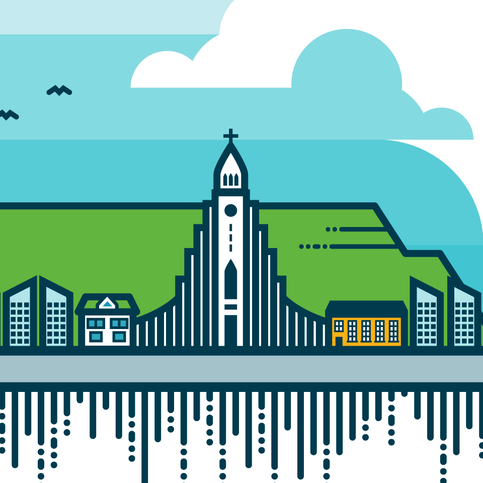
Harpa Conference & Concert Hall Rebranding
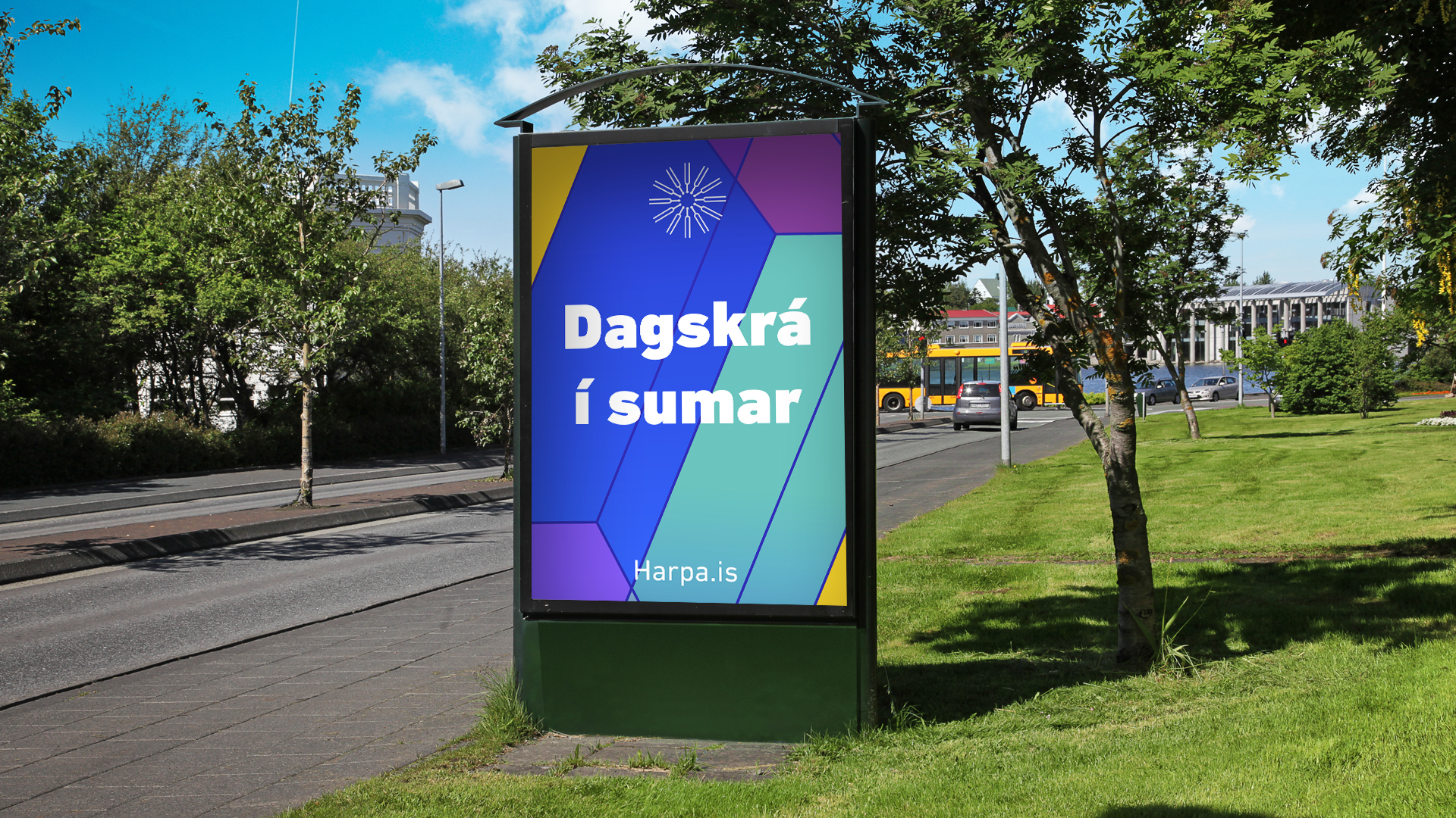
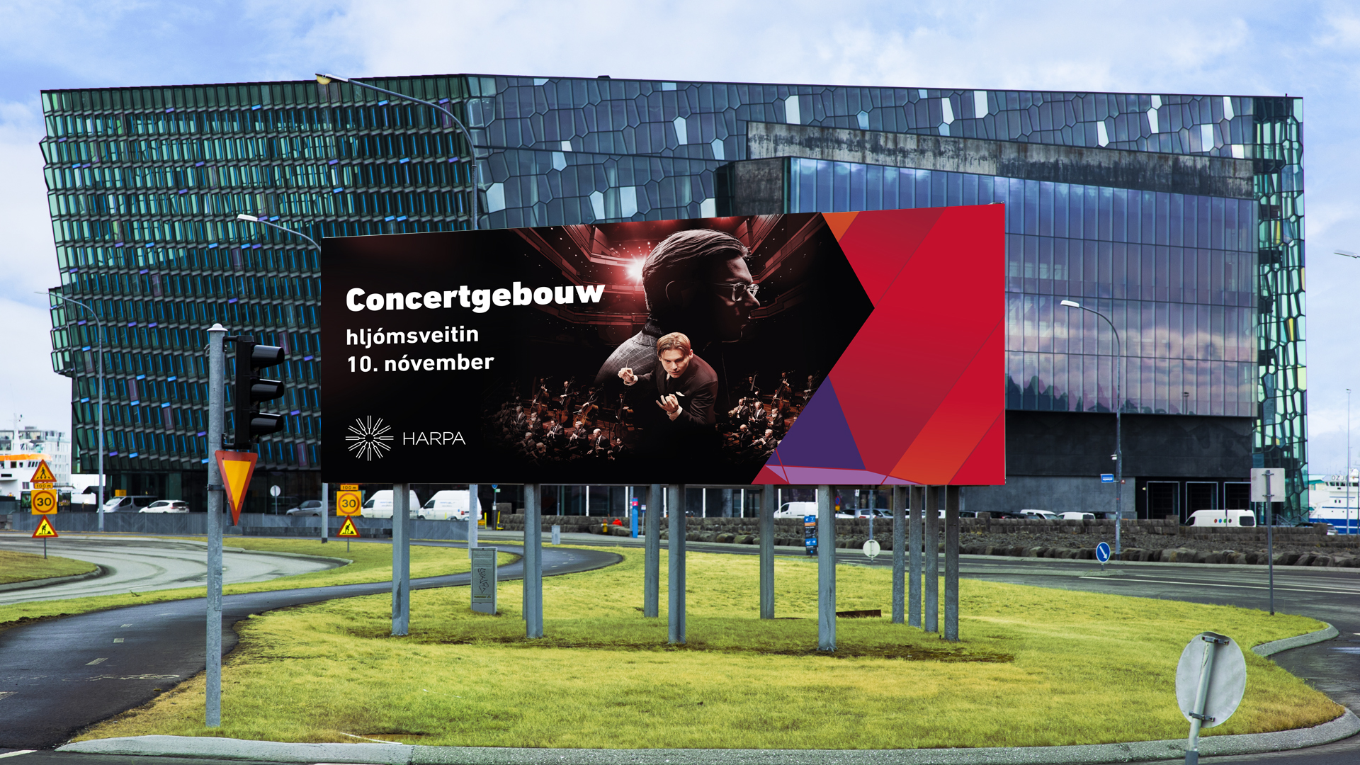
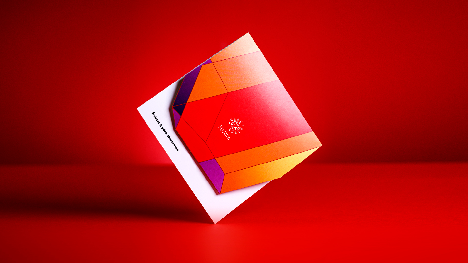
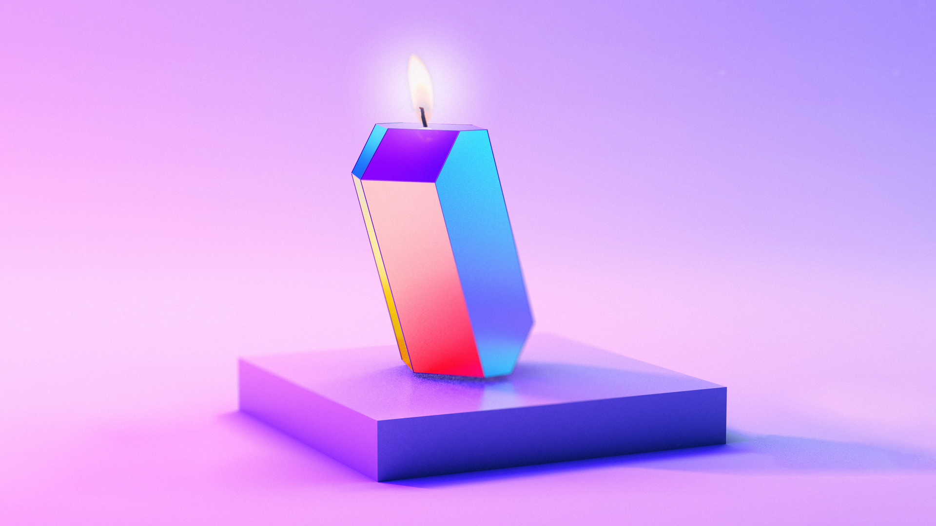
The Harpa Cultural Center was at a turning point. On the occasion of its tenth anniversary year, Harpa's image was redefined, with emphasis on making it more accessible and lively.
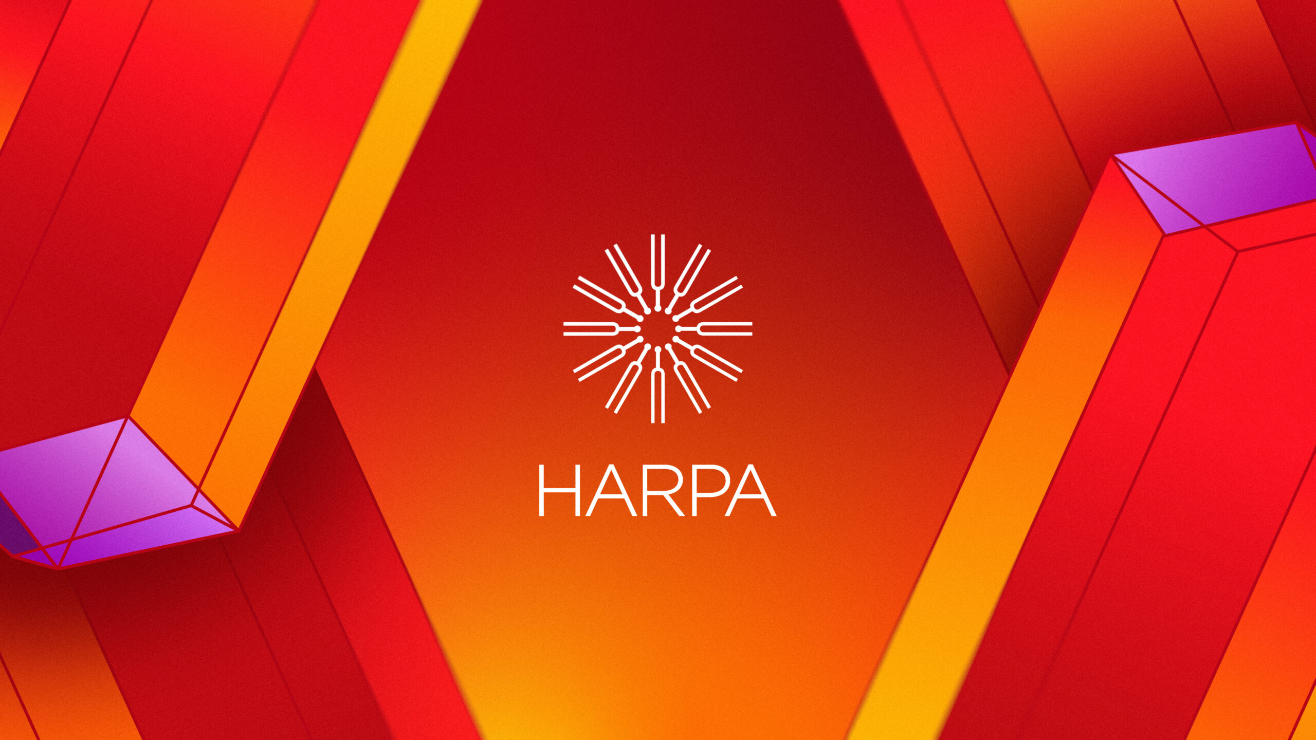
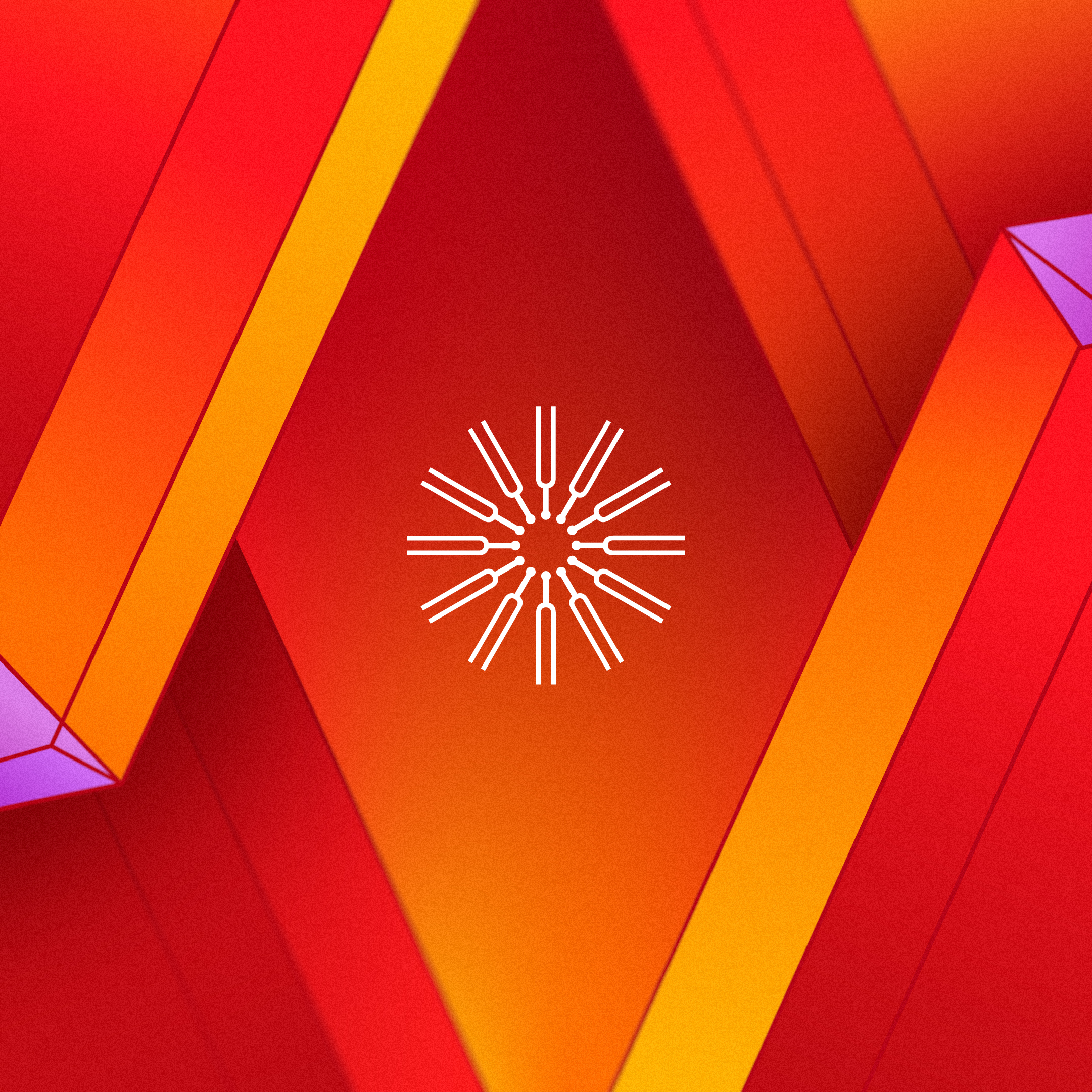
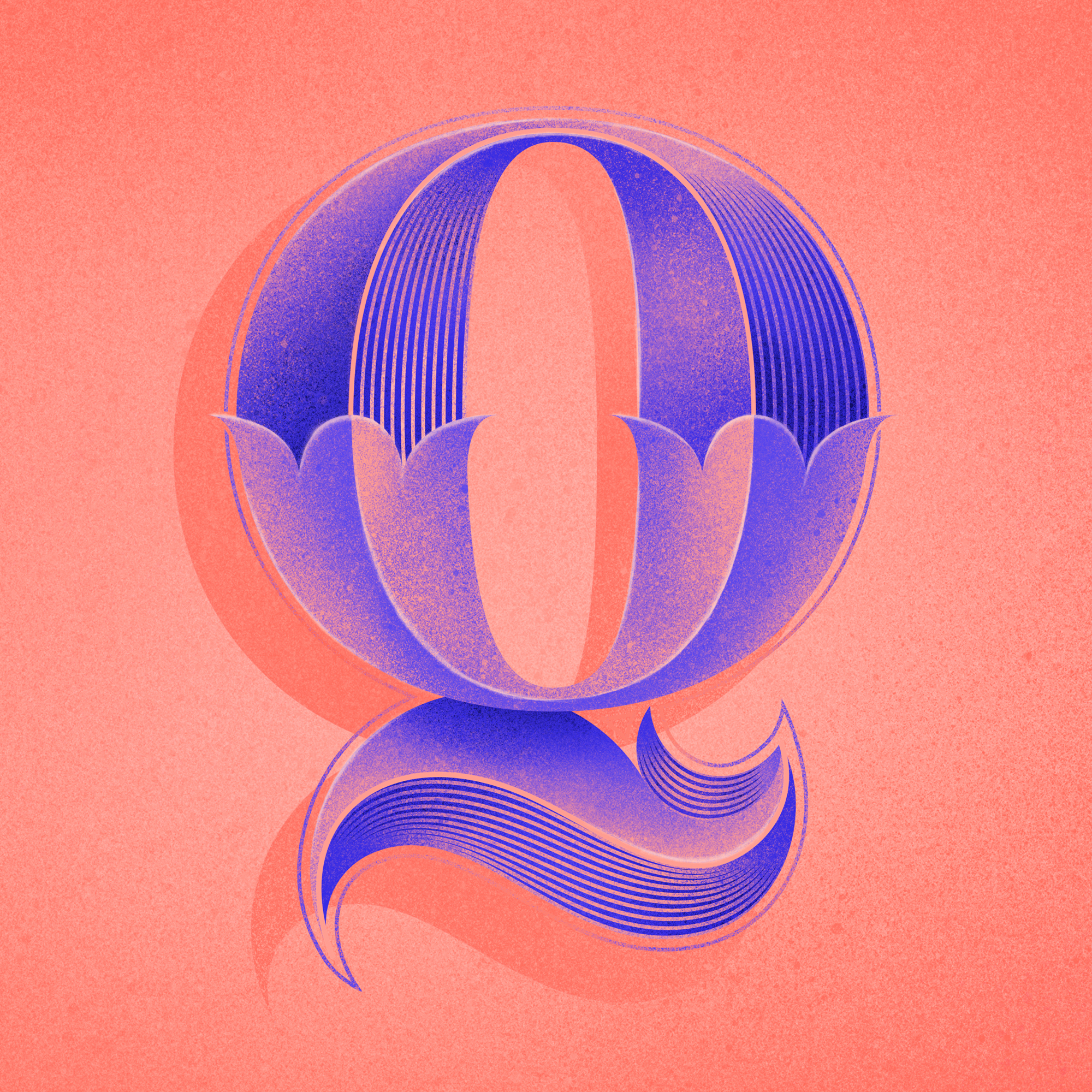
Harpa's brand is a multifaceted experience, alive, experimental but classic at the same time. We thought it was important that the house had an acoustic signature as well, so we created a sound logo from the musical instrument on which Harpa's logo is based.
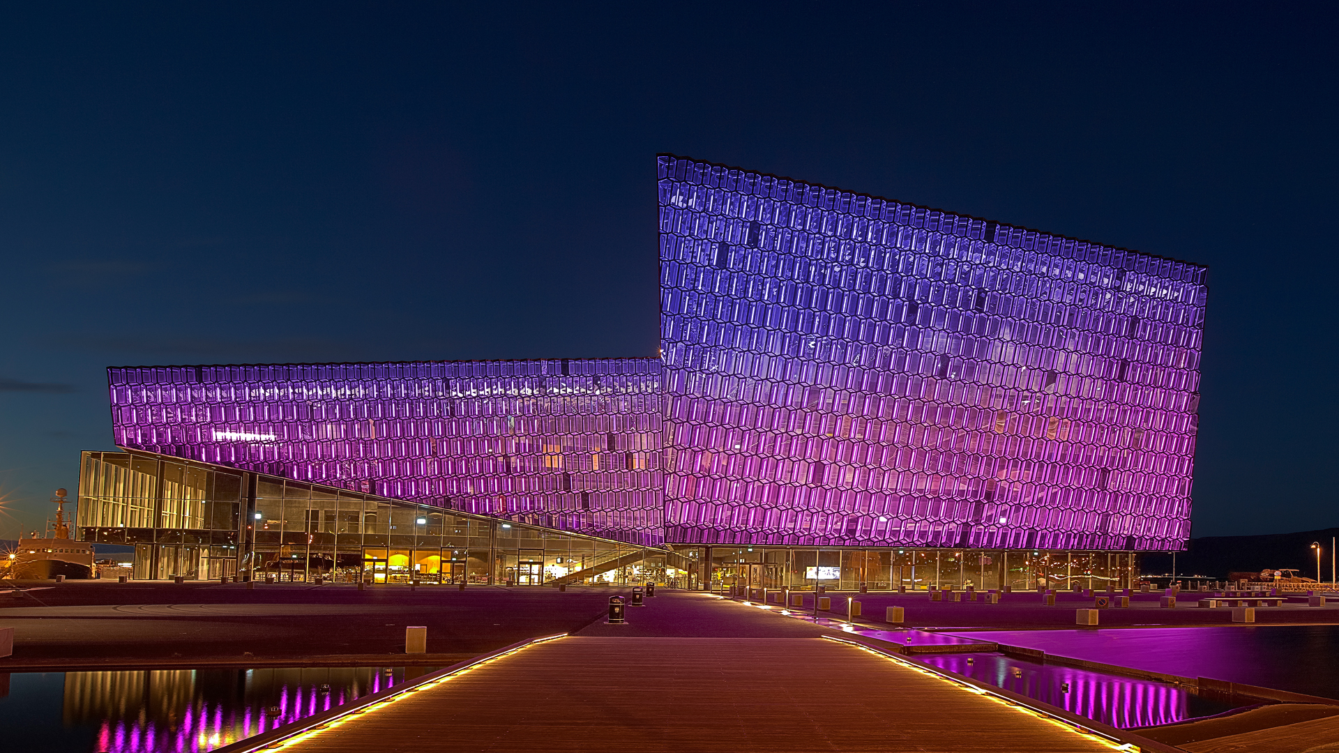
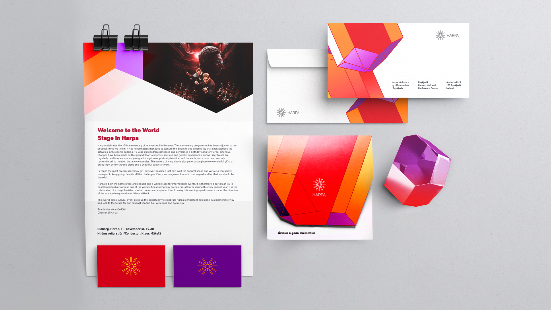
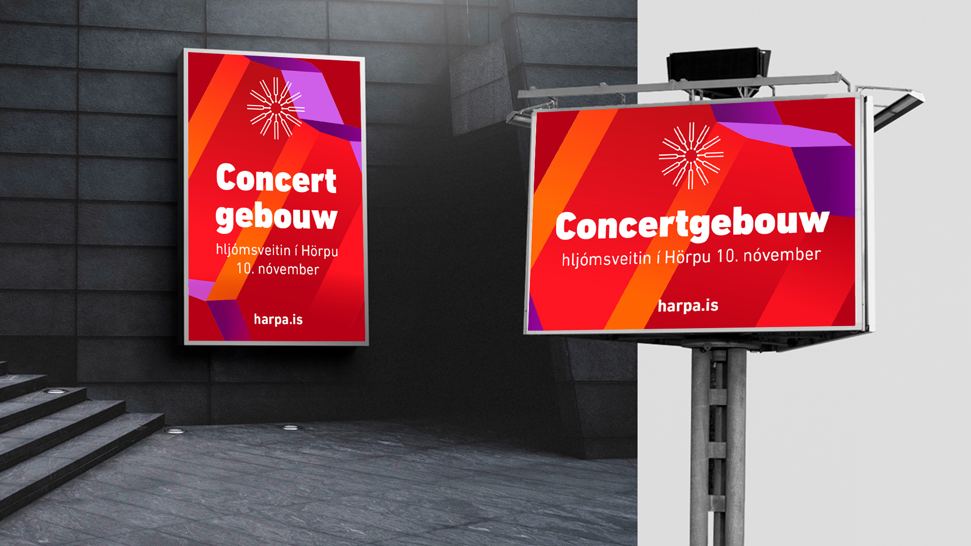
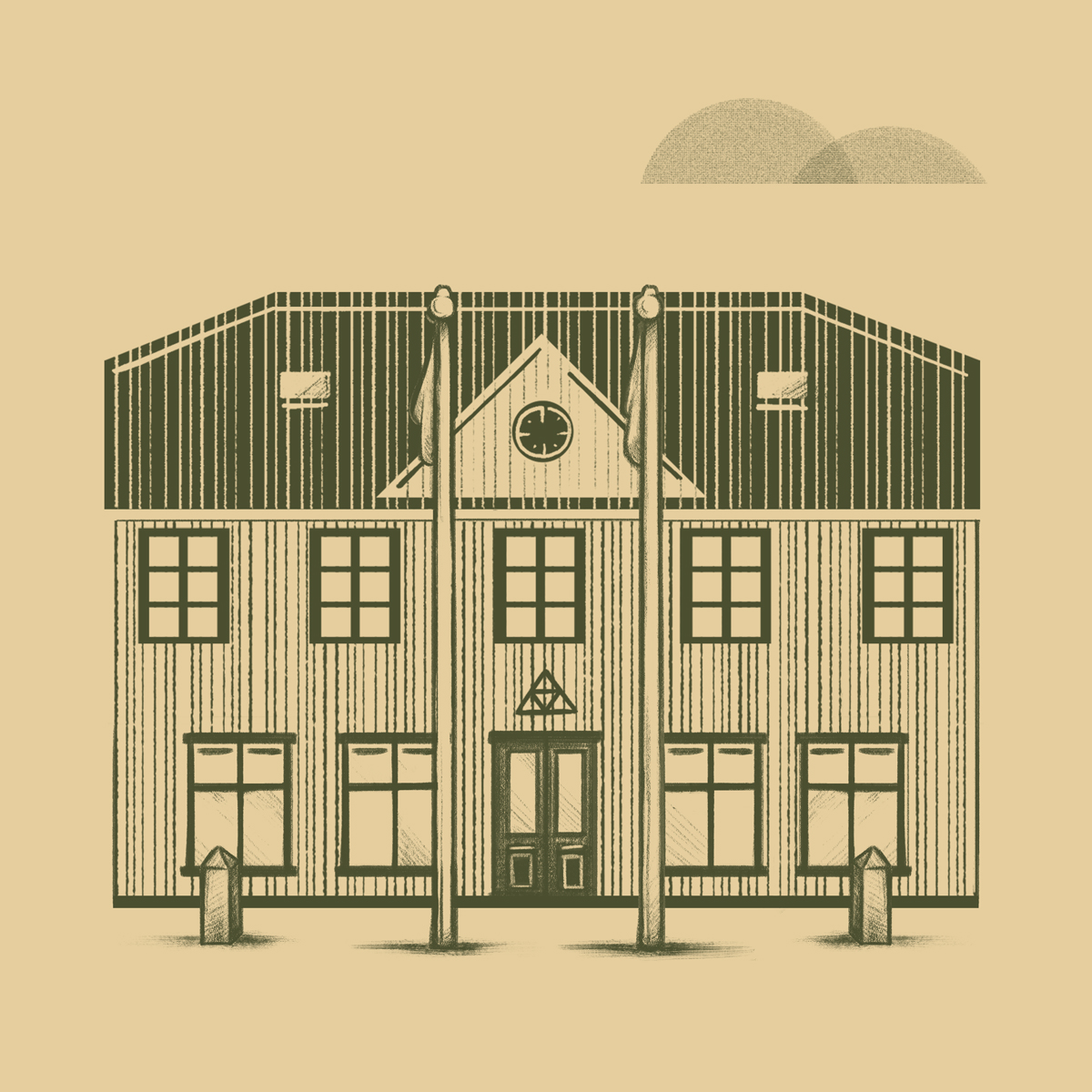
The new brand stands at the foundation of the building itself, which is a world-class work of art. The basic shape in the glass building blocks is called the "Quasi" brick, a unique Icelandic creation. The shape of the Quasi-brick was our starting point for the creation of the new brand, both in 2D and 3D versions. In this way, the strongest feature of the nation's house, the building itself, becomes the cornerstone of its brand identity.
Hvíta húsið, 2021
Harpa Conference & Concert Hall Rebranding
The Harpa Cultural Center was at a turning point. On the occasion of its tenth anniversary year, Harpa's image was redefined, with emphasis on making it more accessible and lively.
Harpa's brand is a multifaceted experience, alive, experimental but classic at the same time. We thought it was important that the house had an acoustic signature as well, so we created a sound logo from the musical instrument on which Harpa's logo is based.
The new brand stands at the foundation of the building itself, which is a world-class work of art. The basic shape in the glass building blocks is called the "Quasi" brick, a unique Icelandic creation. The shape of the Quasi-brick was our starting point for the creation of the new brand, both in 2D and 3D versions. In this way, the strongest feature of the nation's house, the building itself, becomes the cornerstone of its brand identity.
Hvíta Húsið, 2021
More
Síminn rebrandingBranding
Harpra Concert HallBranding
36 days of type 2022Lettering / Type design
The Washington PostLettering & Ilustration
36 days of type 2021Lettering / Type design

Arion bankIllustration

36 days of type 2020Lettering / Type design
Gamba3D Animation
Piss, kúkur, klósettpappírAnimation
AmpersandIllustration
Ja.is campaignAdvertising
Company of the yearIllustration
36 days of type 2019Lettering / Type design
Já.is rebrandBranding

PortraitIllustration

FrjálsiLogo design
ReitirIllustration
36 days of type 2018Lettering
TerraIllustration

Veröld VættannaIllustration
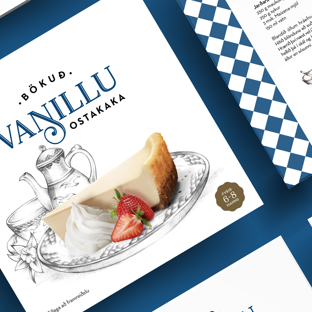
MS' cheesecakeIlustration

Best banking appIllustration

LífeyrissparnaðurIllustration
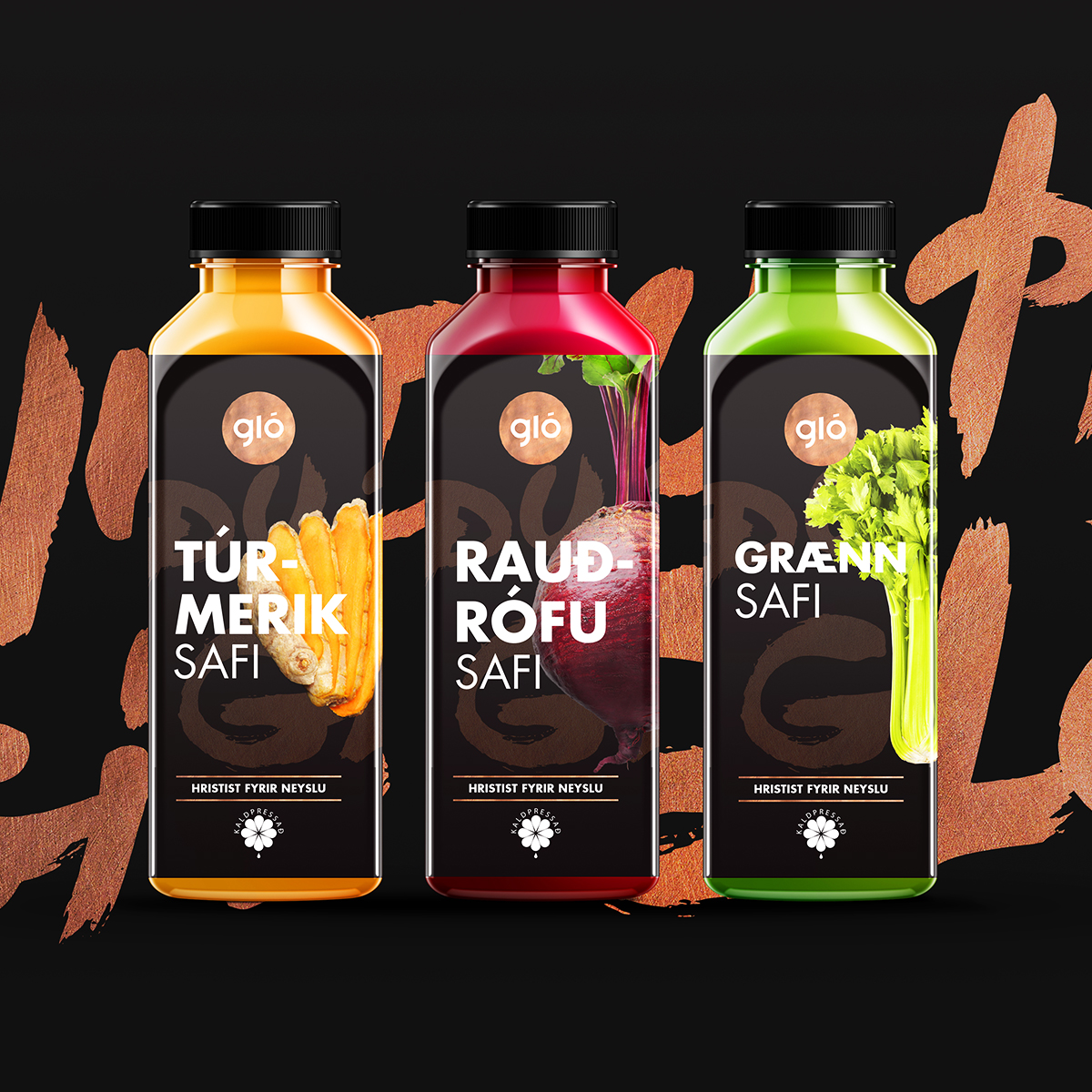
Gló to goPackaging
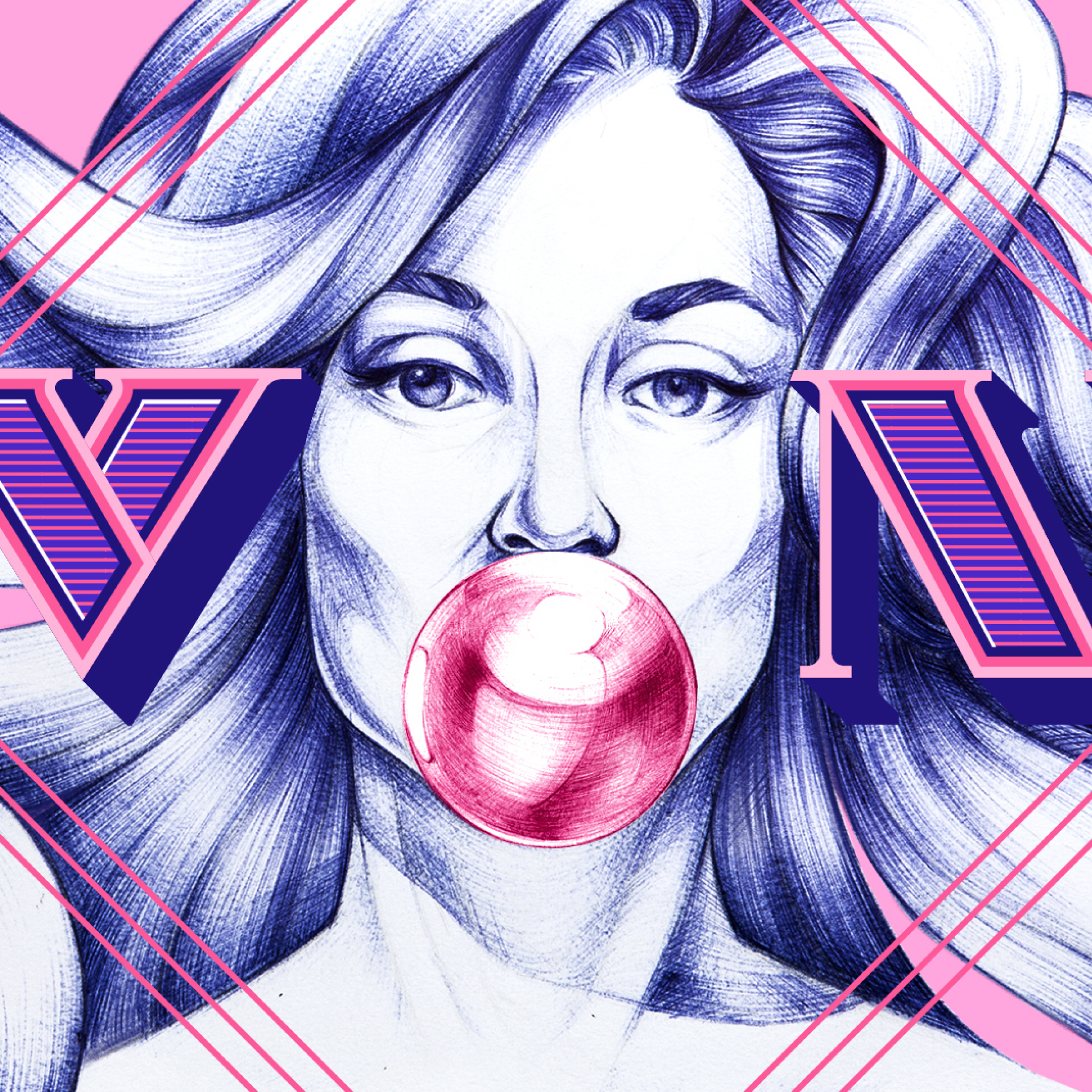
VonIllustration
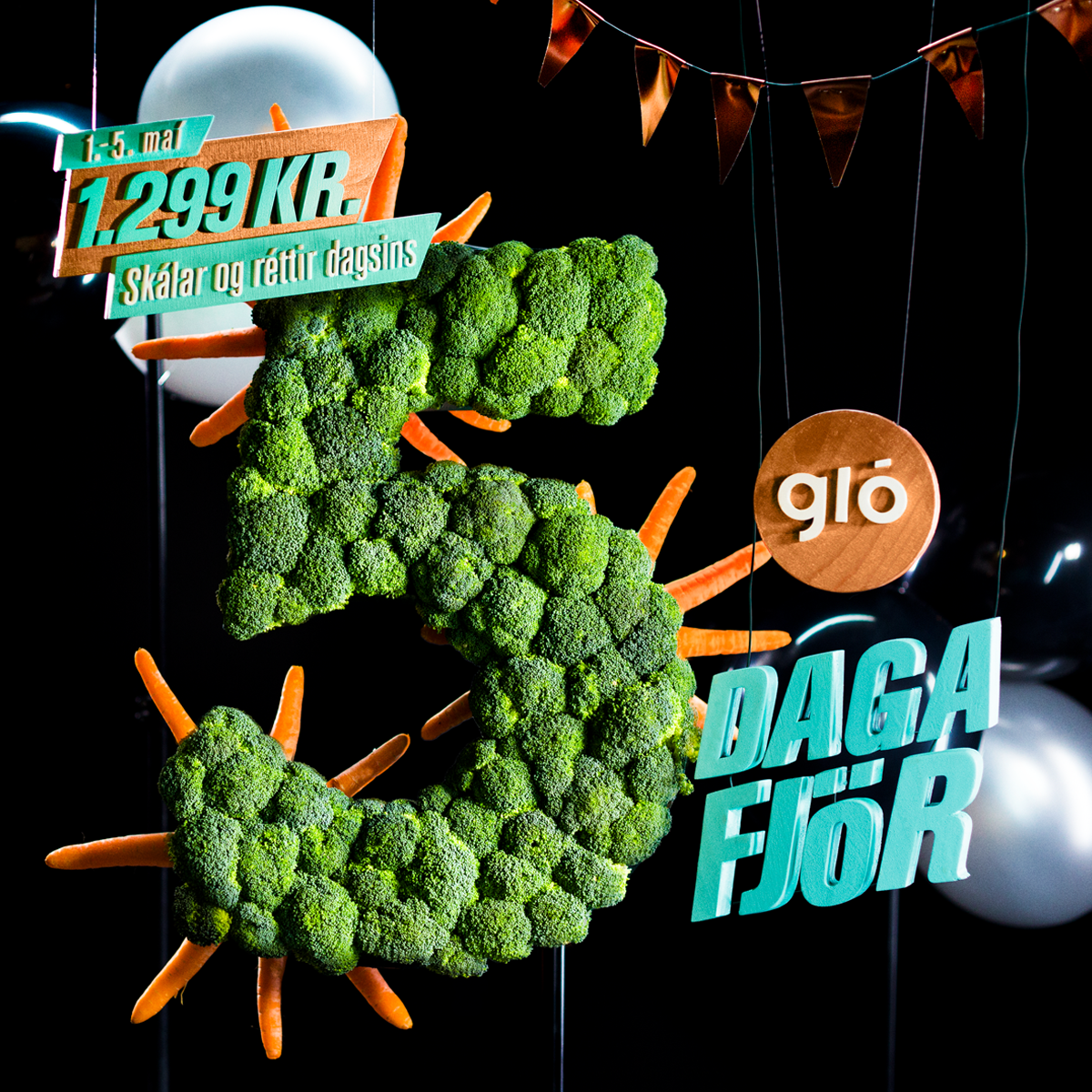
Fimmdaga fjörAdvertising
VeiturIllustration
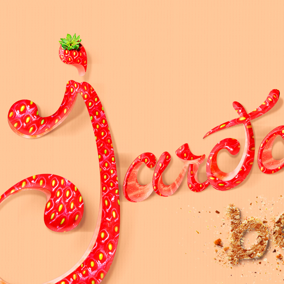
JarðarberjabakaLettering