Síminn Rebranding
Síminn is a well-established company that has experienced rapid growth in recent years, expanding its offerings to include a diverse range of services and entertainment options. While we began our rebranding efforts with a strong foundation, our analysis led us to prioritize a brand experience that is family-friendly, reliable, and modern.
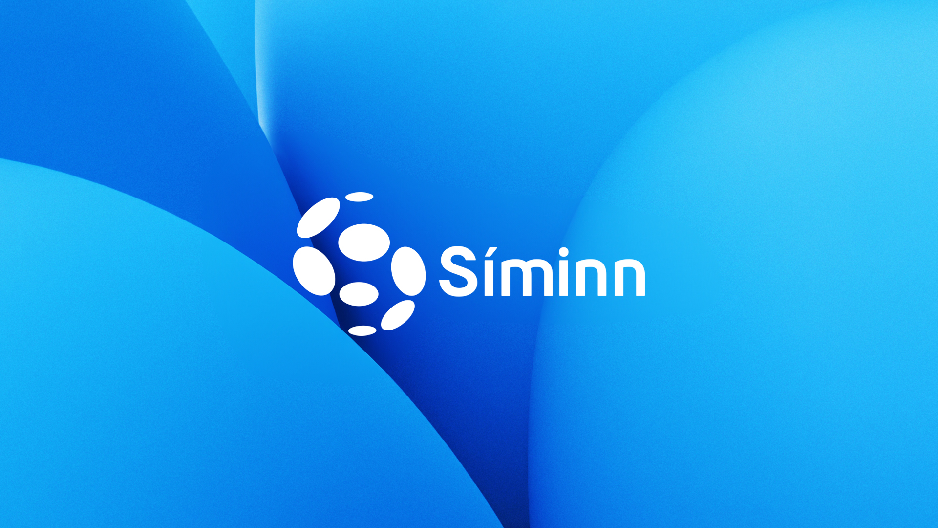
Most people recognize the Síminn logo and the iconic 'telephone blue' color, which is why we wanted to pay homage to them. We refined the brand and utilized it as the cornerstone for a flexible and contemporary transformation applicable across all our media platforms.
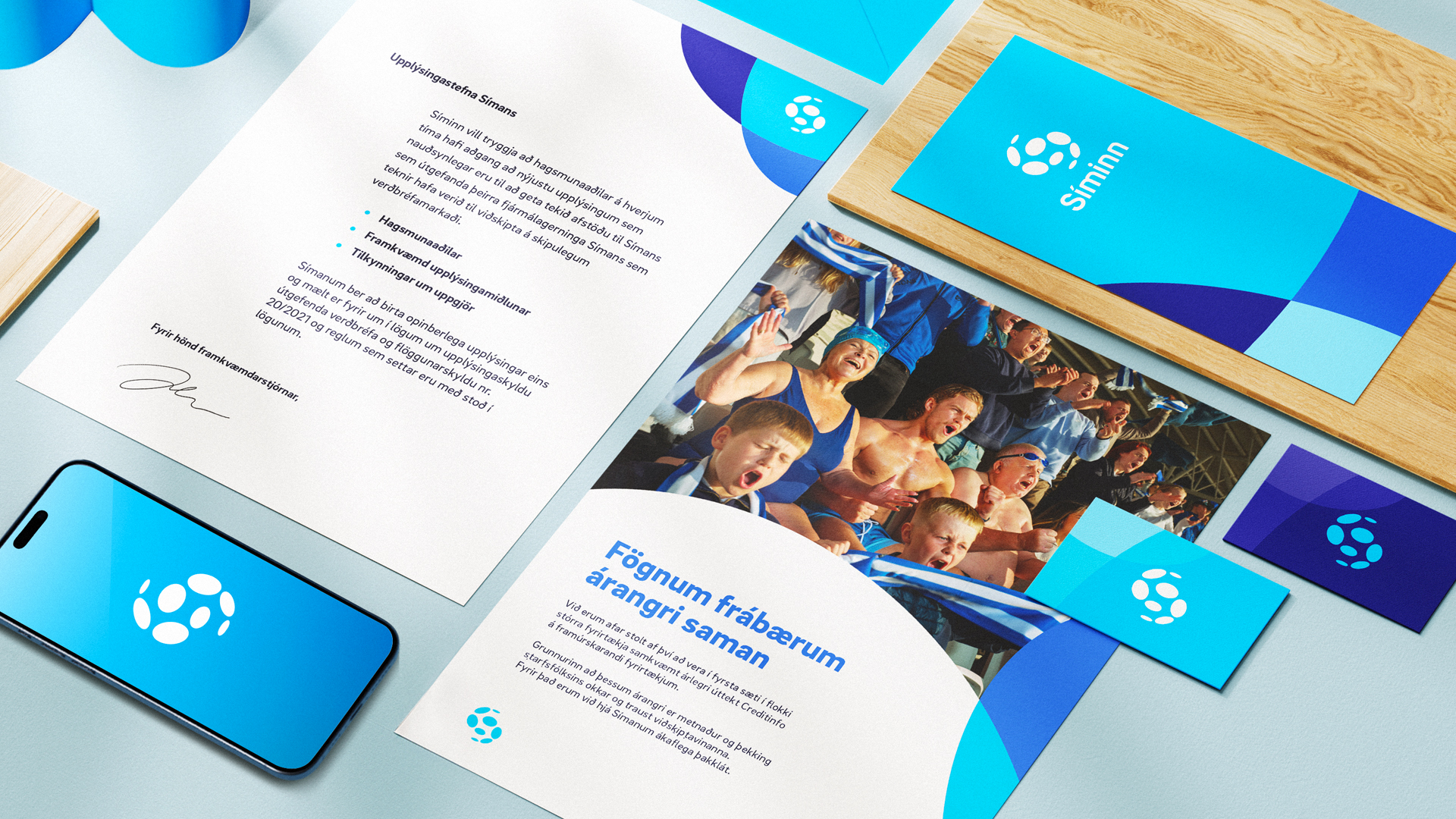
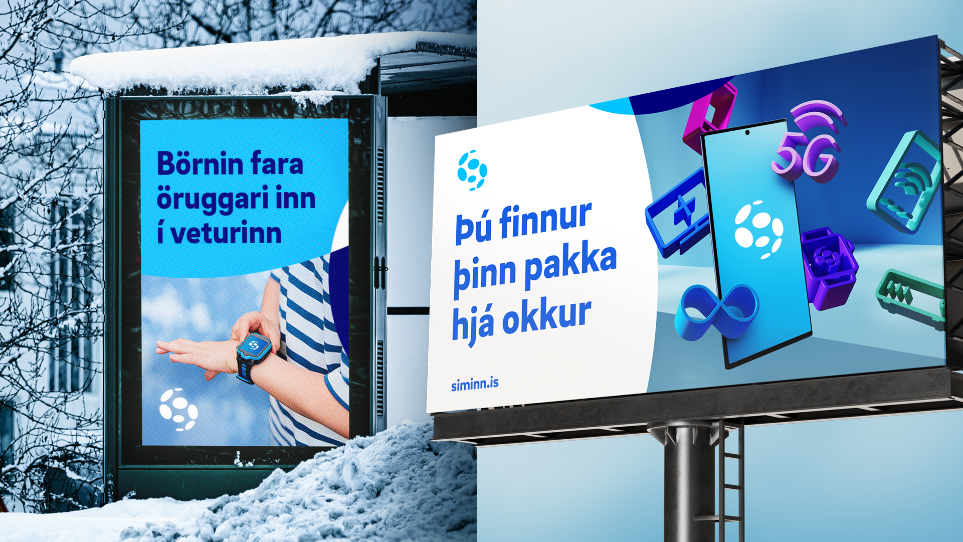
Our color palette revolves around various shades of blue, each assigned to different services for easy differentiation. Additionally, we introduced a captivating 3D animated world, enhancing the brand's appeal with a fresh and polished aesthetic.
Hvíta húsið, 2023
Síminn Rebranding
Síminn is a well-established company that has experienced rapid growth in recent years, expanding its offerings to include a diverse range of services and entertainment options. While we began our rebranding efforts with a strong foundation, our analysis led us to prioritize a brand experience that is family-friendly, reliable, and modern.
Most people recognize the Síminn logo and the iconic 'telephone blue' color, which is why we wanted to pay homage to them. We refined the brand and utilized it as the cornerstone for a flexible and contemporary transformation applicable across all our media platforms.
Our color palette revolves around various shades of blue, each assigned to different services for easy differentiation. Additionally, we introduced a captivating 3D animated world, enhancing the brand's appeal with a fresh and polished aesthetic.
Hvíta Húsið, 2023
Síminn rebranding
Síminn is a well-established company that has experienced rapid growth in recent years, expanding its offerings to include a diverse range of services and entertainment options. While we began our rebranding efforts with a strong foundation, our analysis led us to prioritize a brand experience that is family-friendly, reliable, and modern.
Most people recognize the Síminn logo and the iconic 'telephone blue' color, which is why we wanted to pay homage to them. We refined the brand and utilized it as the cornerstone for a flexible and contemporary transformation applicable across all our media platforms.
Our color palette revolves around various shades of blue, each assigned to different services for easy differentiation. Additionally, we introduced a captivating 3D animated world, enhancing the brand's appeal with a fresh and polished aesthetic.
2023
More
Síminn rebrandingBranding
Harpra Concert HallBranding
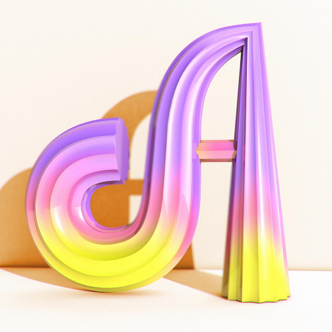
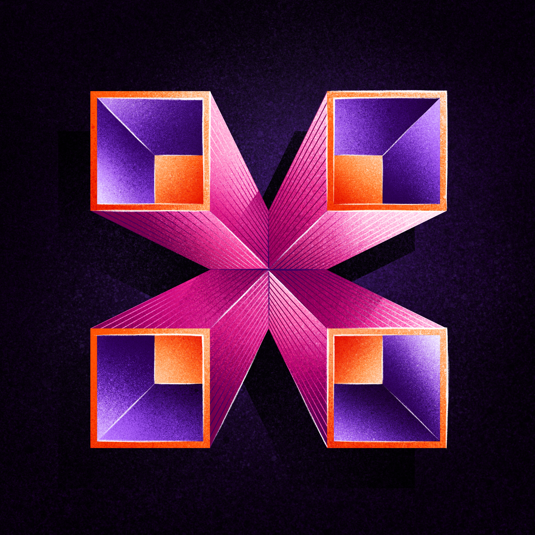
36 days of type 2022Lettering / Type design
The Washington PostLettering & Ilustration
36 days of type 2021Lettering / Type design

Arion bankIllustration

36 days of type 2020Lettering / Type design
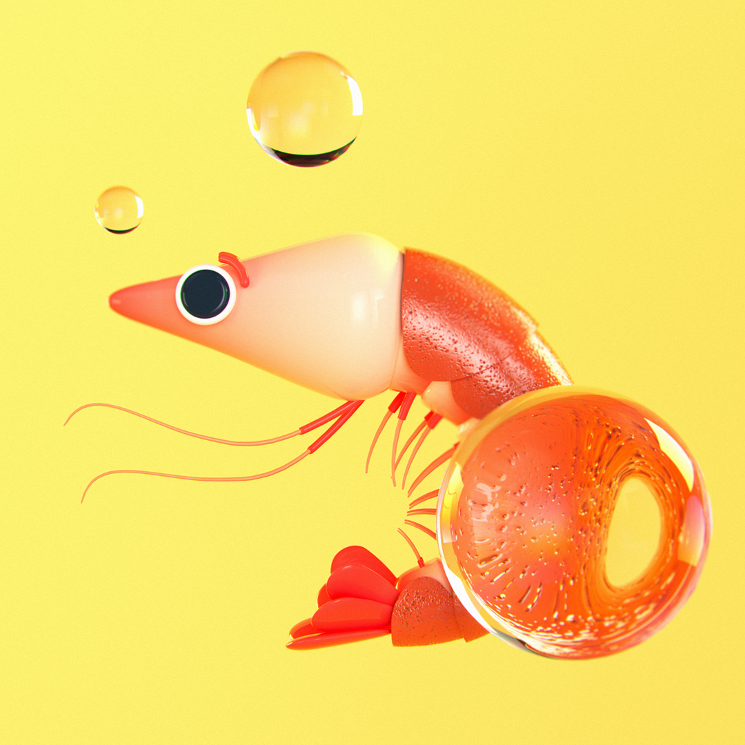
Gamba3D Animation
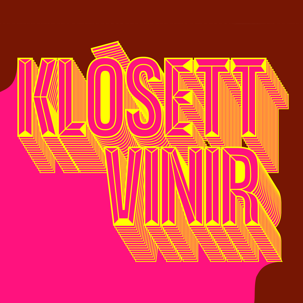
Piss, kúkur, klósettpappírAnimation
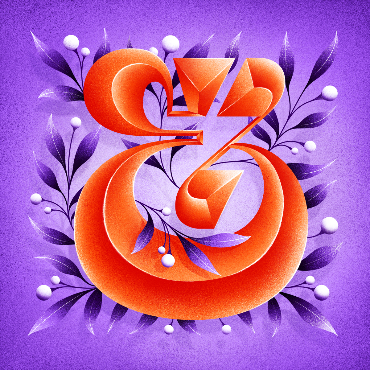
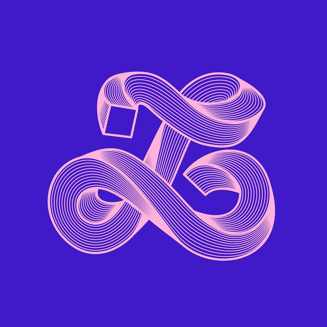
AmpersandIllustration

Ja.is campaignAdvertising
Company of the yearIllustration
36 days of type 2019Lettering / Type design
Já.is rebrandBranding

PortraitIllustration

FrjálsiLogo design
ReitirIllustration
36 days of type 2018Lettering
TerraIllustration

Veröld VættannaIllustration
MS' cheesecakeIlustration

Best banking appIllustration

LífeyrissparnaðurIllustration
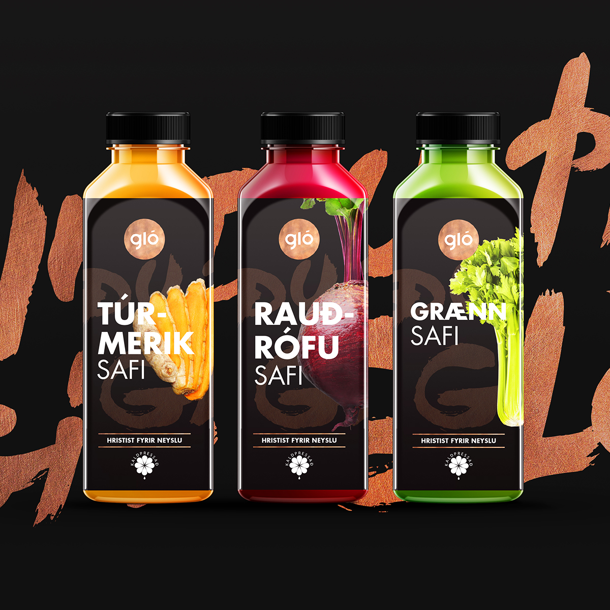
Gló to goPackaging
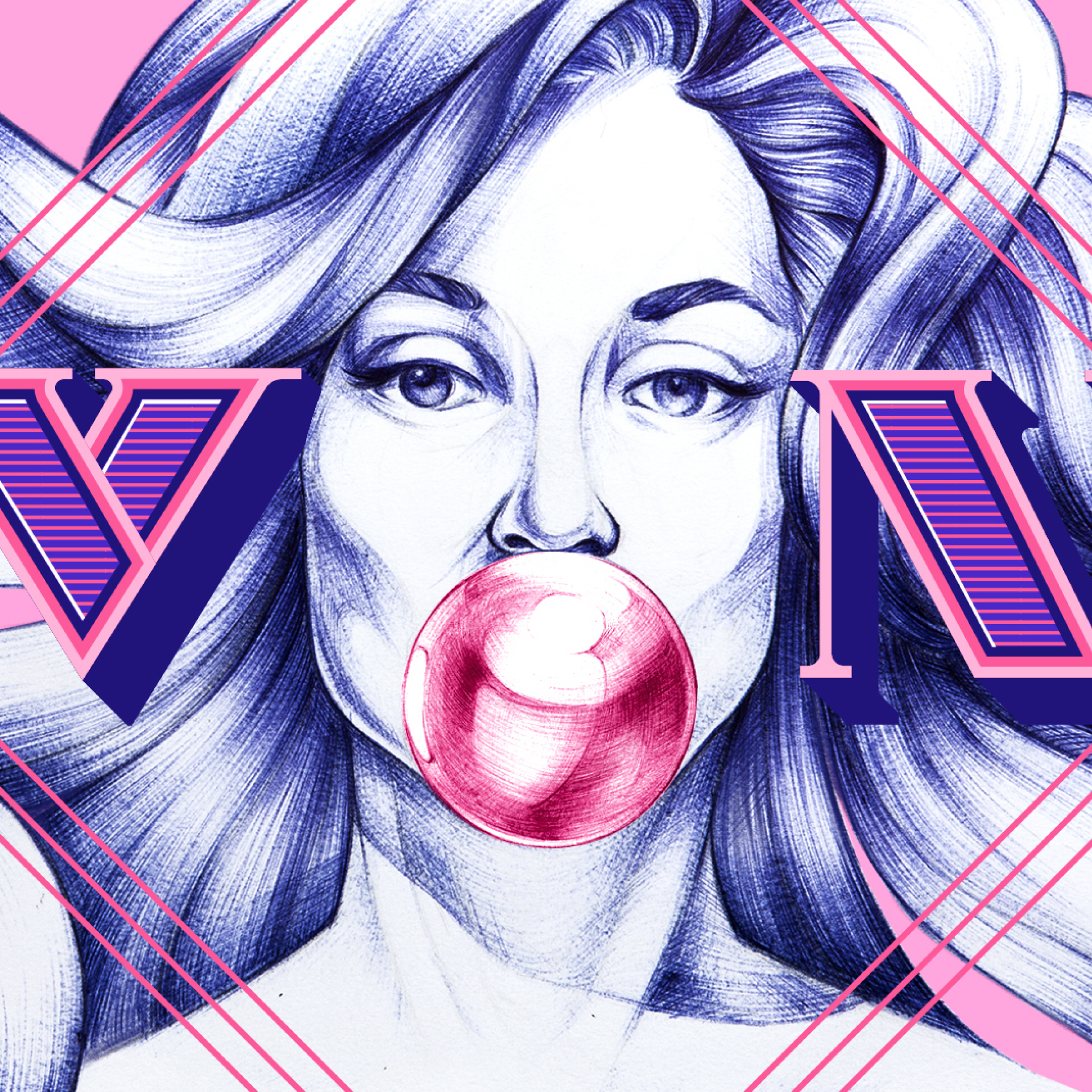
VonIllustration
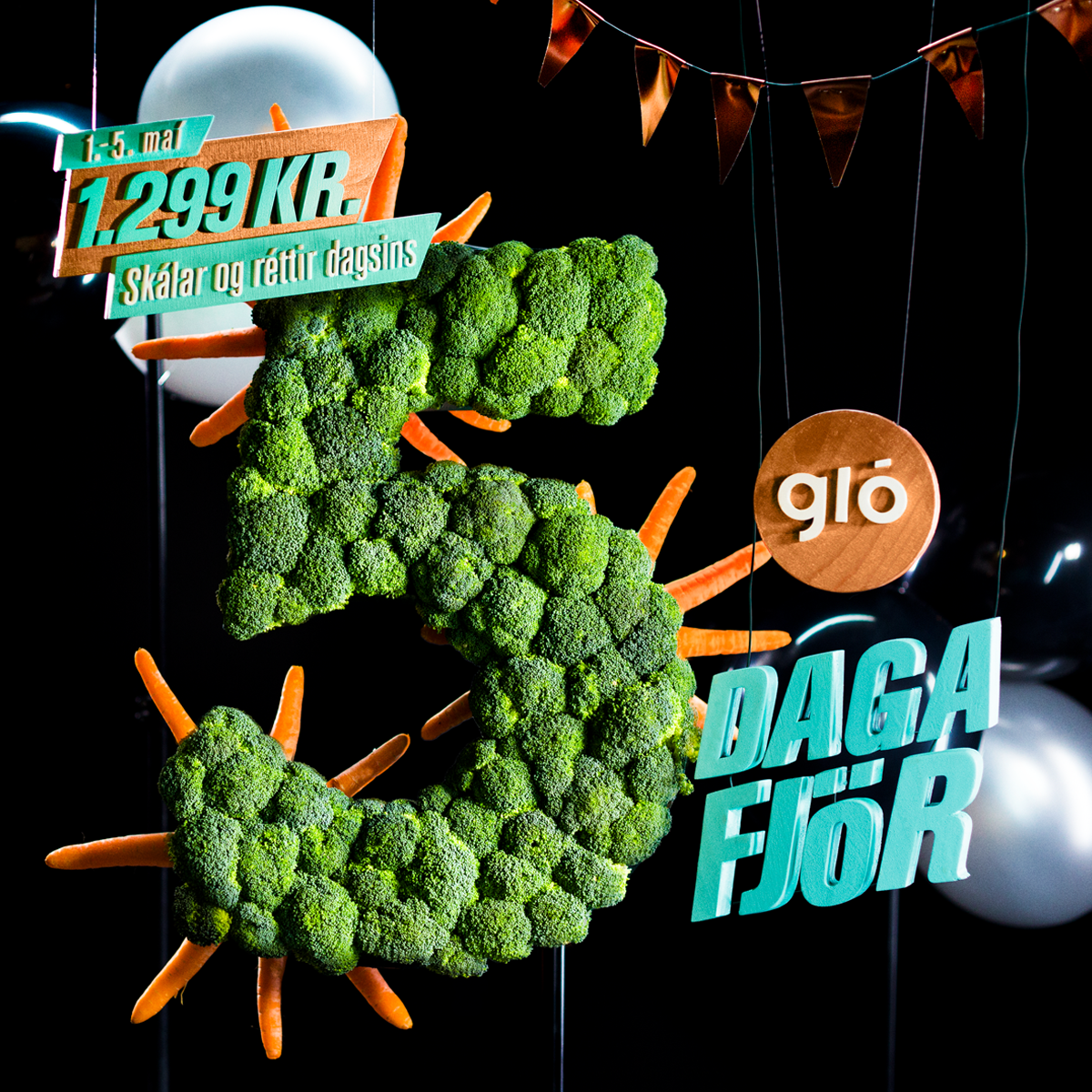
Fimmdaga fjörAdvertising
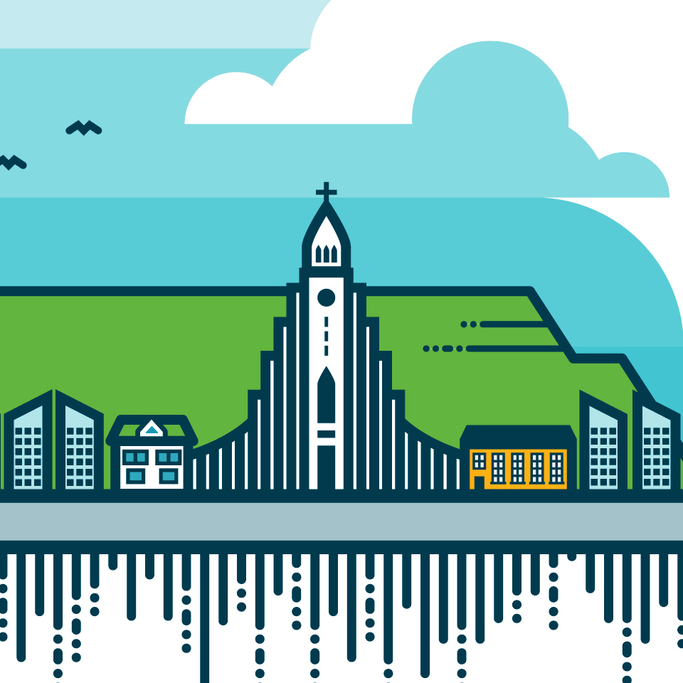
VeiturIllustration
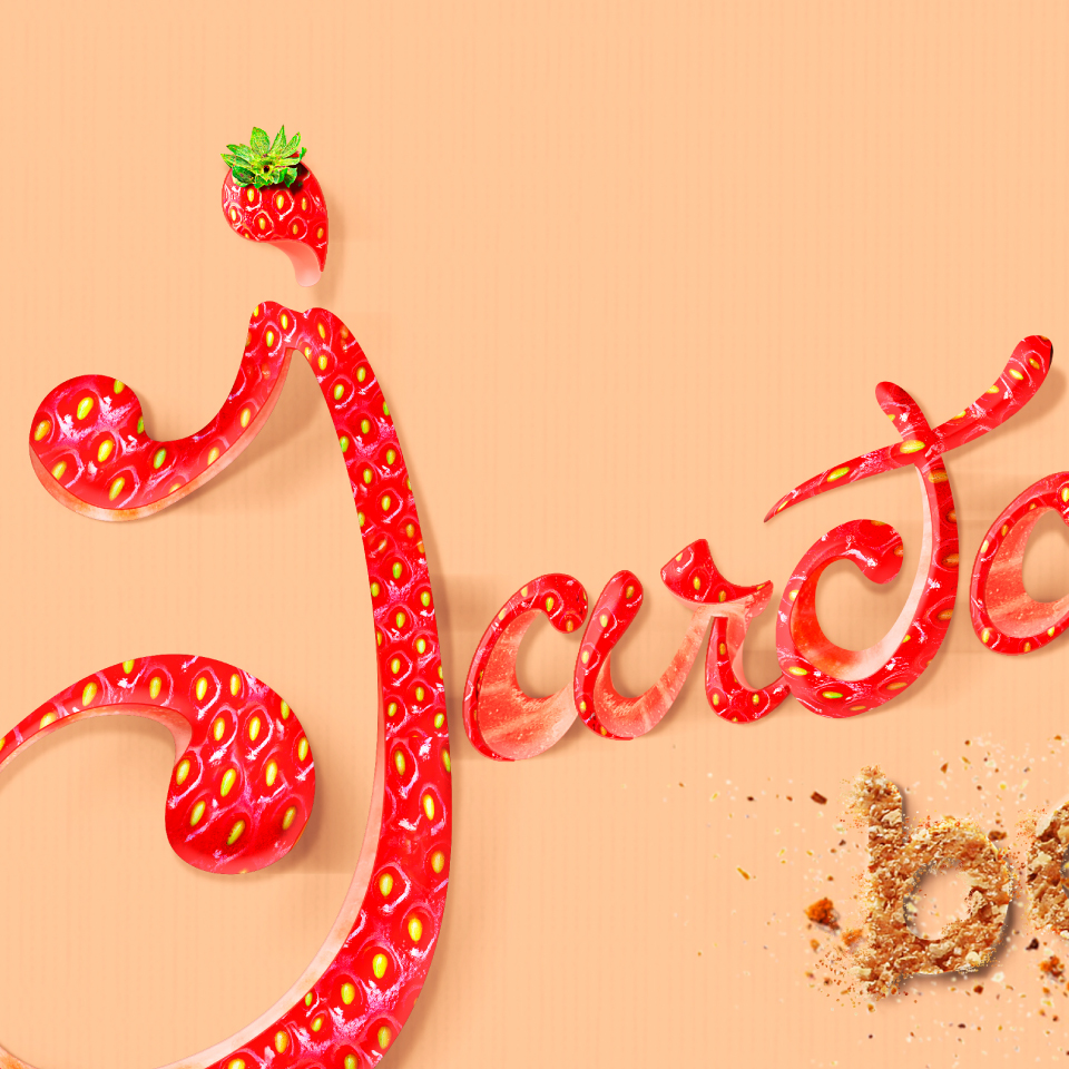
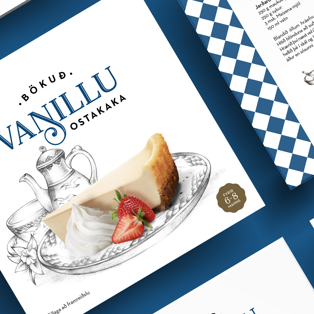
JarðarberjabakaLettering